b26 does not display icons properly in data mode; fine in graphics mode; fine in data mode using b18…see pics.
Anybody else see this? What version of macOS are you running? I have not seen this problem on multiple computers.
10.15.2 Catalina
sorry, mistyped. 10.15.3
Well this is the sort of disaster I was worried about with the switch to a new SDK. But what’s really puzzling is that so far this is only happening on one computer out of twenty.
The toolbar icons are all hand tuned for position and size by trial and error. I had to adjust all of the tool icons for the switch to the macOS 11 SDK. Until your report, the size and position has at least been consistent on all computers, so that this hand tuning only had to be done once. If this isn’t consistent on some computers, for now I am at a complete loss as to how to proceed.
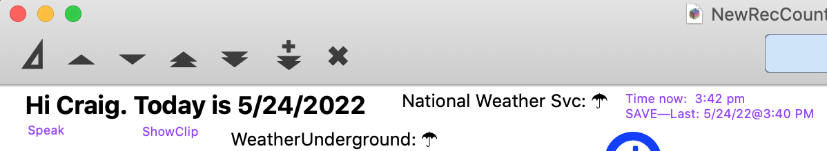
FWIW, I opened several complicated forms in b26 and they look fine in either mode, however, when I go to graphics mode, icons in the tool bar are cut in half. The pieces still work, but they are not drawn correctly.
When I set my toolbar to small icons the bottoms are cut off.
I reported it yesterday on another thread but that whole thread seems to be missing today.
It’s not missing, but it was posted to staff only, so most people here won’t be able to see it. I can still see your post, it’s in the topic Feedback needed for Panorama X b26. You should be able to see it also.
My icons on OS 10.13.6 are as follows: (note that I earlier said I was running on 10.11, and that was incorrect):

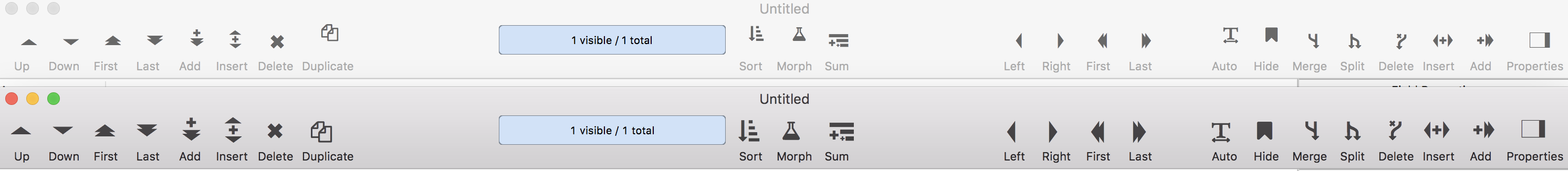
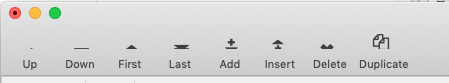
Also using OS 10.13.6. The tool bar for b26 is on top. The tool bar for b25 is below for comparison.
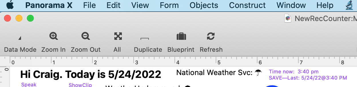
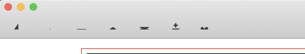
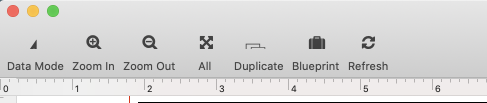
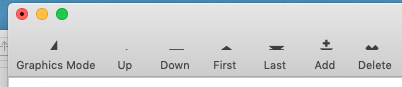
Here’s another oddity…in GraphicsMode, the icons appear:
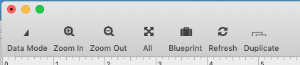
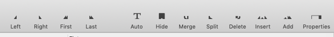
DataMode, Zoom In, ZoomOut All, Duplicate, Blueprint and Refresh:
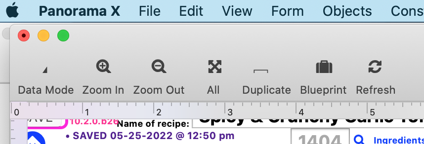
But inDataMode, I can see a tiny bit of the Data Mode icon, and what looks like the tip of a triangle showing further right, BUT, when I click on the triangle tip, the database adds a new record (an icon option I did not see in GraphicsMode…
•••Catalina
In macOS Monterey 12.4 the icons in the data sheet are slightly truncated, but otherwise icons are complete (eg, in form graphics mode).
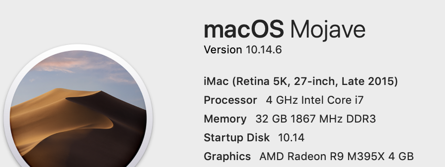
Here are my B26 Form examples from Mojave 10.14.6:
Data Mode:
Graphics Mode:
Data Sheet Examples:
I think there are two separate issues in regard to the toolbar icons.
First of all, if you are using the small icons, they are slightly cut off. I am seeing that on my computer, so this should be straightforward to address. I think this may be happening on all versions of macOS.
The second problem has so far only been reported on Mojave and Catalina, but may not occur on all computers running these versions of macOS. On these systems some icons are almost completely shifted down so they are 95% invisible.
I just went back to my Mojave system, and good news – the problem is visible there also. Apparently when I tested before I didn’t try a window with a tool bar. So maybe it is all Mojave and Catalina computers. Anyway, this is great news for me that I have access to a machine that demonstrates the problem.
No problems visible here using .b26 with High Sierra 10.13.6 in any of the twelve permutations (icons/text/both; large/small; data/graphics mode.
You’re right about Monterey: when the small icon size is not used, the icons display normally.
At the risk of further clouding the waters on this subject, here are some of my observations (for what they may be worth). Note: these are all taken with 12.4 Monterey and will be different on some earlier OS versions.
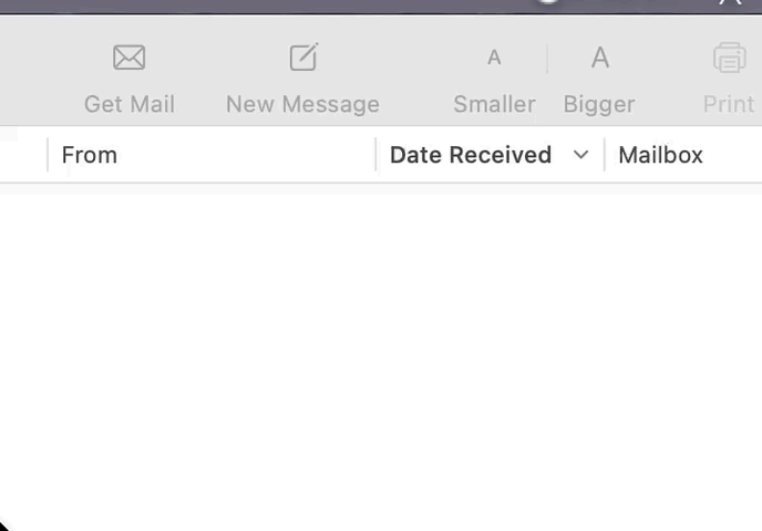
Apple no longer seem to use the “Use Small Size” option for any of their tool bars. For the Mail app toolbar they use “Icon and Text”, “Icon Only” or “Text Only”. Changing between the options does not affect the height of the tool bar but only the size of the icons as shown below:
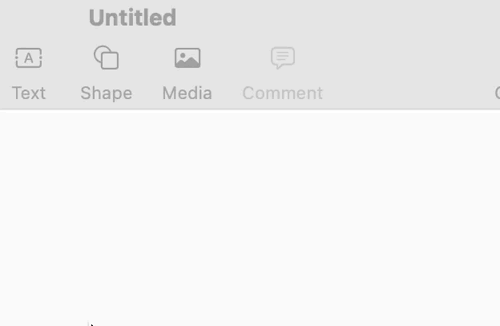
The Pages app however only offers “Icons and Text” and “Icons Only”. Changing between the options here does not affect the icon size but only reduces the height of the tool bar when "Only Icons is selected:
Panorama X toolbar usage is way more complex than what Apple is currently doing in their apps. In Panorama X when the “Use Small Size” option is not checked and “Icons and Text” is selected the tool bar’s height is expanded. When “Icons Only” or “Text Only” is checked the tool bar’s height is reduced. When the “Use Small Size” is selected with “Icons and Text”, the toolbar is slightly reduced in height and the icons and text are squeezed together horizontally, the icon size remains the same but the text is slightly reduced. When the “Use Small Size” is selected with “Icons Only”, the icons remain the same size but the toolbar height is reduced and the icons are squeezed together horizontally. When the “Use Small Size” is selected with “Text Only”, the tool bar height is reduced, the text size is slightly reduced and the text is crammed closer together. This all seems way more involved than needed and could all be simplified by eliminating the “Use Small Size” option altogether.
As a further note regarding the icons themselves, the Apple Developer pages for Toolbar Items in the Human Interface Guidelines states: “If you create custom glyphs, use a maximum size of 19x19 pt (38x38px @2x).”
Again, just sharing my thoughts on the subject in case they are of any use.