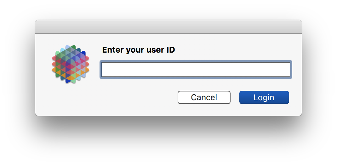
In this latest build, the GetTextDialog and SuperGetText windows are configured differently. The Panorama icon is positioned at the top center and all the elements of the dialog are centered below.
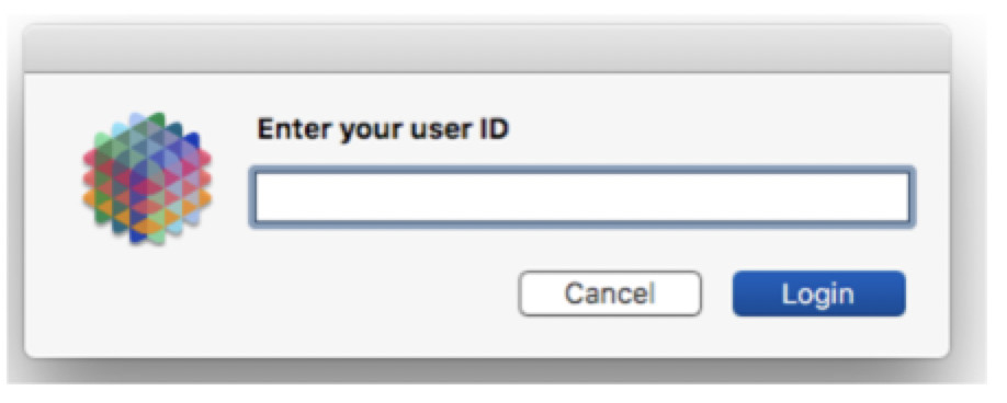
Using an example from the Help file:
gettextdialog ID,
    "Prompt","Enter your user ID",
    "Sheet","NO",
    "Button","Login","AbortButton","Cancel",
    "Width",300
Welcome to Big Sur – did you just upgrade macOS? It’s been that way since last fall, and ALL applications do this, not just Panorama (and not just the latest build, in fact Panorama 10.0 will do this also). This has been a big topic of discussion anywhere Mac developers congregate. Most developers think this change was a mistake, but apparently Apple doesn’t think so, because they haven’t changed it in Monterey. The prevailing wisdom is that this change was intended to make macOS more like iOS. If you don’t like it, contact Apple, but they’ve definitely heard this feedback already.
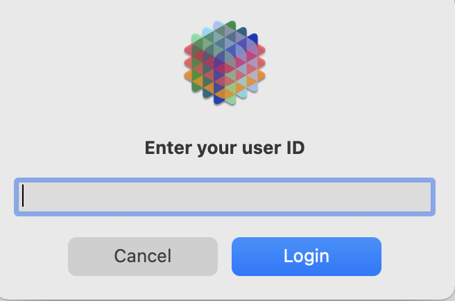
Must be the first time I’ve pursued GetText in a while, I’ve been on Big Sur for some time. It’s the size of the buttons that made it an issue for me. Oddly full words work out better than single characters.
As my previous screen shot showed Cancel and Login fit side by side. But we trying to use =, < and > the buttons are full width and stacked vertically. The Cancel runs right off the bottom.
But surely you must have noticed this new arrangement in every new alert and dialog in every application in Big Sur? This isn’t a Panorama change, it’s system wide. Panorama is just “going with the flow” and supporting the Apple user interface conventions.
I think the reason the first one has side by side buttons is because you specified a width of 300 for the text editor. But the layout arrangement is all controlled by Apple. I’m not sure what you would actually search for, but I’ve seen dozens of examples over the past year of people complaining about how these alerts are layed out. Clearly someone high up at Apple things this is great It does make it more difficult to tell apart an iOS app running on Big Sur from a native macOS app.
Actually, this statement has always been limited to 3 buttons (because the underlying Apple API only supports 3 buttons). So the Cancel button hasn’t run off the bottom, it simply is ignored.
The fact that only 3 buttons are supported is mentioned in the documentation. However, perhaps it should cause an error if you specify more than 3 buttons? I’m not sure if that would be an improvement or not.
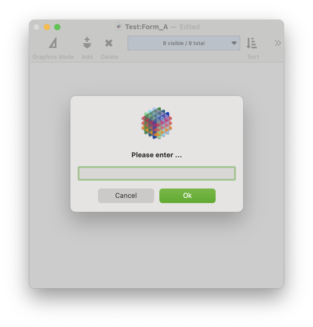
If you want to control the layout yourself, rather than leaving it up to Apple, the only choice is to create a form and use rundialog.
Another option would be to use the supergettext statement, which does use a form so the layout hasn’t changed (the buttons are still arranged horizontally). However, this statement is also limited to 3 buttons – so I think for this application you probably will need to create a custom form for this dialog.
I pulled the example code right out of the documentation, it works perfectly. Here it is with the sheet option set to YES, the dialog is attached to the window:
Aaaah - sheet vs form. It doesn’t look any different when I use it with forms - but maybe it never did. I missed the subtlety of the ‘sheet’ prompt (actually its not subtle, I just missed it.) Sorry.
On my computers using Big Sur, gettextdialog and some other dialogs, e.g. alertsheet, are not attached but free floating when sheet=“Yes”. I think they are centered on the top window of the same DB. I can drag the window around and the dialog goes with it, and I can select other windows, unlike gettext dialogs.
In Big Sur sheets don’t drop down from the toolbar any more, but they are still attached to the window that was active. As you noted, dragging the primary window will also move the sheet, and the sheet is modal to that window but doesn’t prevent you from accessing other windows. So the look is quite different, but the operation is the same as before - a sheet only applies to the current window, and doesn’t block the entire application.
Personally I’m not a huge fan of the new look, but I suppose it makes macOS look more like iOS and that is apparently the priority for Apple. In any case, this is not a “Panorama” thing, you’ll see the exact same appearance and operation in any application that displays dialogs sheets. For example, the Page Setup and Print dialogs are displayed as sheets. If you take any program and look at these dialogs in Catalina or earlier, you’ll see the old sheets style. Run the exact same program on Big Sur or Monterey and you’ll see the new sheets style. C’est la vie