In my experimentation with Panorama X charts I may have found a possible bug. The graphing engine graphs both positive and negative values. However, if the data contains negative values, the graphing engine kicks out the first row in the text array. For example, in a chart that consists of four bars (four rows of data in the associated text array), becomes only three bars if the text array still contains four rows but also contains one or more negative values.
I can’t duplicate any problem with negative values. For example, here is a table with a negative value.

Unless I’m being blind somehow, this bar chart looks just fine.
Could you clarify the problem you are encountering?
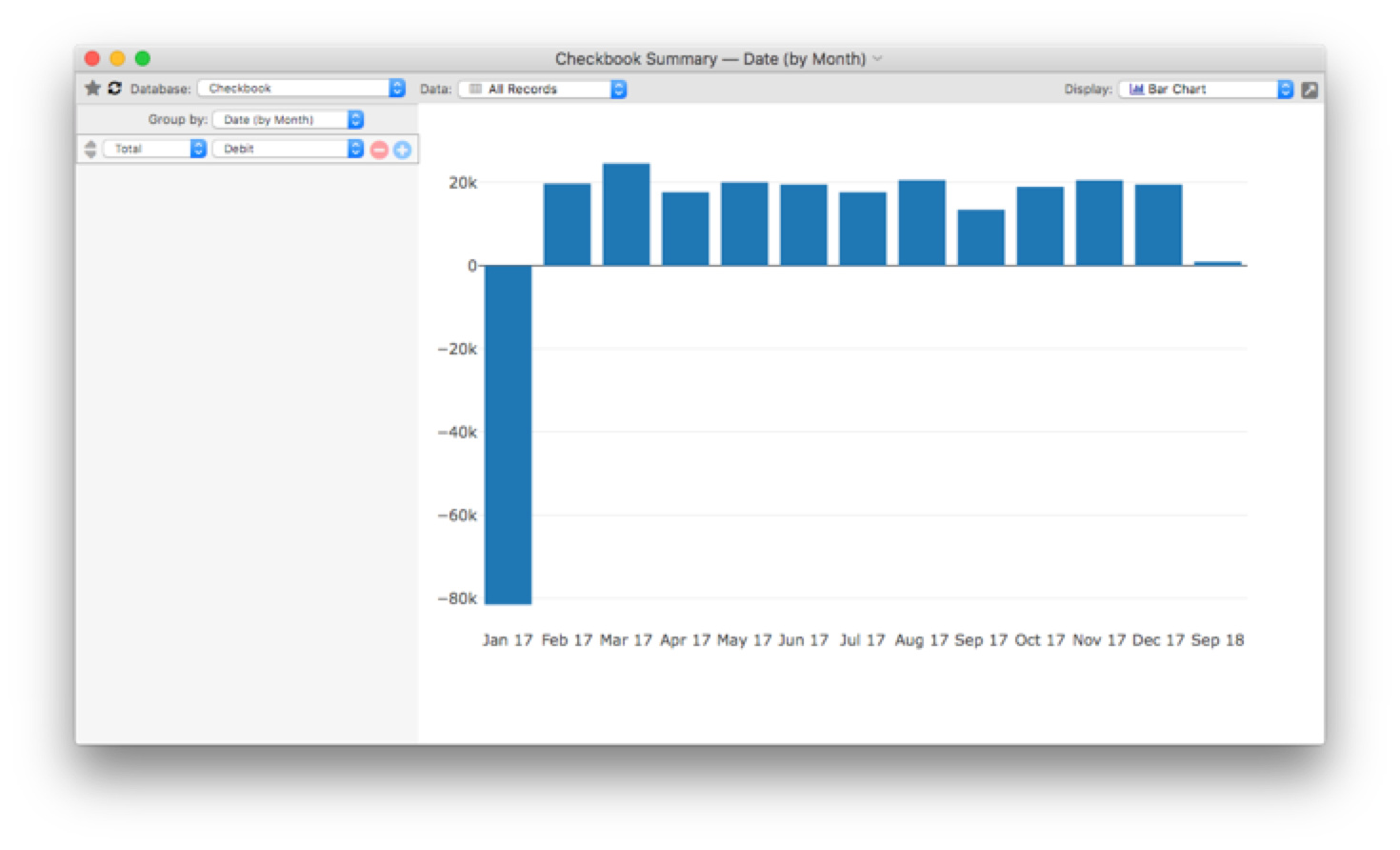
Here’s a screen shot of a query that has all positive numbers:

Here’s a screen shot of a query that has one or more negative numbers:
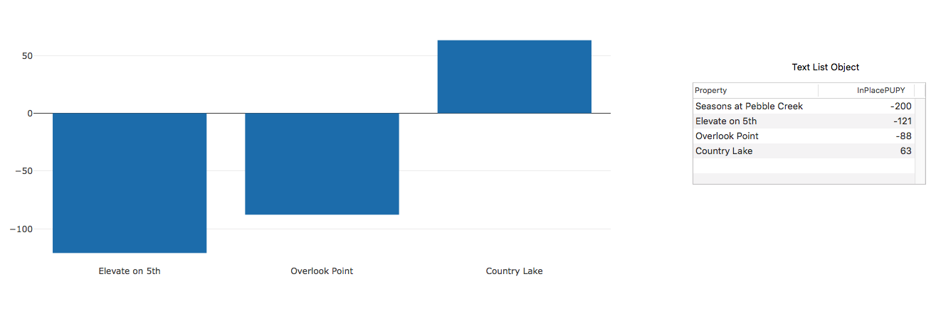
Here some of my code used to generate the contents of the Text List Object and the Chart.
Select Tag = fgTag
Field «InPlacePUPY»
SortUp
FileGlobal fgChart
fgChart = ArraySelectedBuild(cr(), “”, {«Property» + tab() + «InPlacePUPY»})
The Chart uses Chart(fgChart) to generate the bar graph.
Since we don’t have your database, that doesn’t really clarify things. However, charts can definitely display negative numbers, so I think there is something else going on in your data.
Can I send over the database and have someone look at it? It is a fairly simple database. How is the best way to send the file? Zip and email?
Yes, please zip it and send it to the support email address on the provue web site.
Jim, Did you receive my file emailed to you for review?
Haven’t seen any email from you.
I re-sent the file via email. Hopefully it will get through to you. Let me know if you do not receive it.
Please let me know whether or not you received my email. Much thanks!
Ok, I’ve figured out the problem. The chart( function looks for column titles in the first row of data passed to it. If it sees a non-numeric value in the first line, it assumes that value is a column title. The problem was that the code assumes numbers only contained numeric digits and the decimal point, not a minus sign. I have correct this, the fix will appear in the next version. In the meantime, you can easily get your chart working immediately by adding a single semicolon to the start of the formula. This adds an explicit title line, which isn’t needed in this case, but fixes the problem. Something like this, note the extra semicolon before “Platinum”:
chart(";Platinum,68;Gold,49;Silver,34;Uranium,56")
This extra semicolon won’t hurt anything when the new fixed version of Panorama comes out, you could remove the semicolon then, but you don’t have to. For now, the extra semicolon is needed if the first value in the chart is negative.
The reason I wasn’t able to duplicate this problem is because in my tests, there already was an explicit title line. Anyone that generates charts using the Summary or Crosstab workshop won’t encounter this problem. But since you were creating charts by hand for a single record, this bit you – sorry about that.